
IDEA Grad 2025 Cohort 2 applies typography to a quote that implies the past or the future in Tom Duguid’s 2nd-year Typography class
2nd-year students (IDEA Grad 2025) created a fun poster project in Tom Duguid’s typography class. Students were to utilize the theme of either the past or the future, and apply typography to a quote or saying that implied either the past or the future. Shown above: “The Woman I Shall Become” (George Sand) typography poster by Ava Shahres
“I wanted to depict the two sides of a woman, from her youth to her elderly age. Within this silhouette, I did hand lettering to evoke a scattered feel. Much like memories, there is no rhyme or reason, but they come together to create a bigger picture. The ‘I’,” writes Ava Shahres (Instagram: @bastanipop)
Check out some of Tom’s favourites from this project!
“That will never come again is what makes life sweet” (Emily Dickinson) typography poster by Angela

I wanted to capture a feeling of nostalgia—something that's fleeting, fuzzy, yet still ingrained in memory. I decided to play with VHS tape and glitching effects to play off that feeling and chose a flower as my subject to represent joy, delicacy, and ephemerality.
Instagram: @ehhguilar
“Learn from yesterday, live for today, hope for tomorrow” (Albert Einstein) typography poster by Tolan Greyhaven

The goal of this project was to combine illustrative elements with a typographic quote, choose effective typography, and implement our learnings from Typography throughout the course. I found some excellent quotes to work with and explored different typographic treatments before settling on an approach that didn't mash the typography with the illustration too much. I wanted something that worked with my style, but my initial sketches didn't really work to add line work into the typography. So I discovered a photographic reference that I felt fit with my chosen quote. I start by sketching out the portrait and begin to discover where the lines evolve. Some are shadows and contours of the face, others emerge from my pencil marks. Then I move the sketch to digital where I can "Ink" the lines, add the shading and colour, and then to collage and adjust the swirling non-figurative lines. Once I was happy with the negative space I tweaked and adjusted the type placement, and voila!
Insta handle @greyhaven.designs
'I wasted time, and now doth time waste me’ (William Shakespeare) typography poster by Chris R.

For this poster, I chose type that felt at home with the message but contrasted against a modern medium—spray paint and some photoshop magic. My intention was to highlight the timelessness of the quote by tying a thread from the past to the present.
Instagram: @humblehoundcreative
“Appreciate Your Progress” typography poster by Katarina Yaremkewich
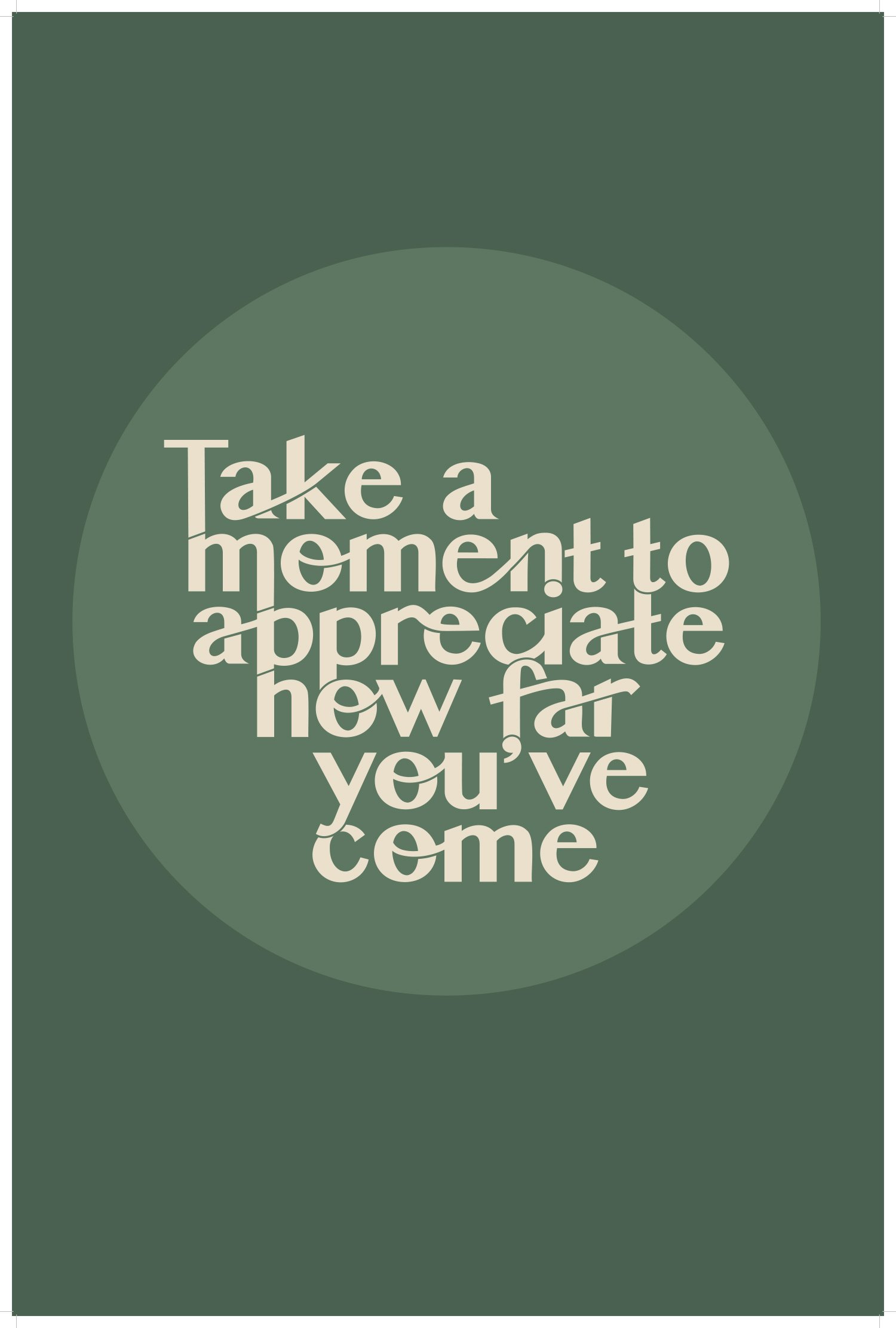
I wanted to focus on alignments and manipulating type for this project. I had a lot of fun creating the layout and finding connections between the letters.
Instagram: @katarina.artwork