
First Year (IDEA Grad 2024) Students Explore Haight-Ashbury, San Francisco Designers with Psychedelic Album Cover Designs
In First Year Survey and Principles of Design, there is often a project to parallel the design movement studied. As part of an exercise to understand the "psychedelic" movement, which began in Haight-Ashbury, San Francisco in the mid 1960’s and had an effect, not just on music, but also on many aspects of popular culture, the students created an album cover to reflect the spirit and aesthetic of the genre.
Shown above: “The Glorious Sons” by Imogen Pettyfer, a modern band gone back in time to the 60s psychedelic era.
Here are a few 60s album cover projects from IDES 142 Survey and Principles of Design II with Vida Jurcic. This year's First Year 1960s inspired album covers were influenced by Haight-Ashbury San Francisco designers such as Peter Max and Wes Wilson.

“Honey Cone” by Alison Koo
I love me some honey and anything warm-toned. It was the perfect combination.
Instagram: @koolibara
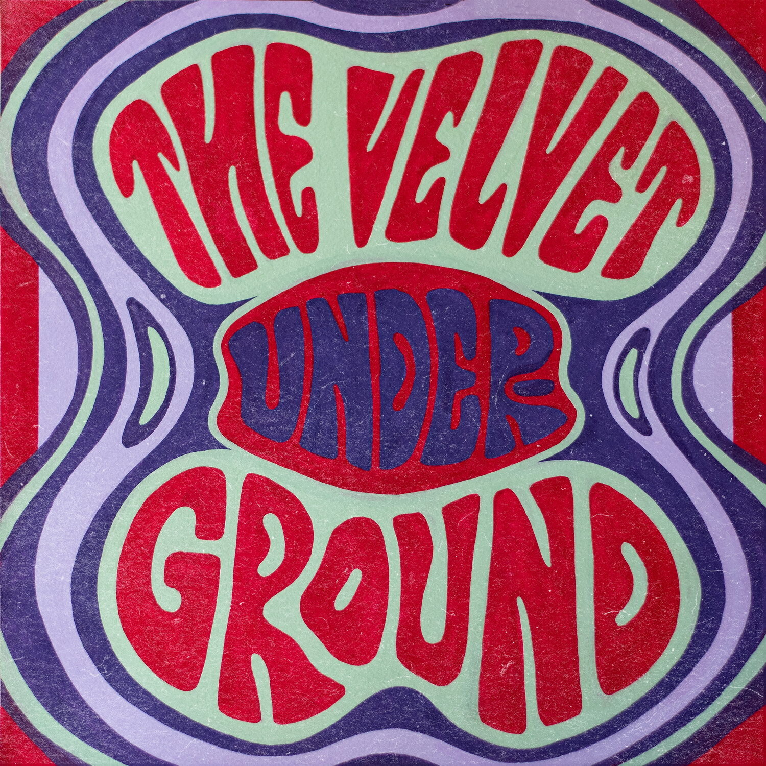
“The Velvet Underground” by Anais Bayle
I was particularly inspired by the psychedelic typography of the ’60s for this design, loosely taking inspiration from the type and colours of Wes Wilsons’ posters. The original piece is painted with gouache, to which I then added a digital texture overlay to imitate a vintage record cover.
Instagram @anaisbayle_art

“The Voidz” by Antonia Scott
I used inspiration from The Voidz own modern design and feeling and combined it with the typical characteristics of a psychedelic poster.
Instagram: @toniscootscoot

“Paramore” by Freya Emery
When we were first assigned this project, my mind almost immediately went to Paramore. For most of my high school years, I was obsessed with Paramore, and more recently, I’ve gotten back into them. When designing the album cover, I knew I wanted to showcase the band members using a halftone effect. I found this assignment to be a lot of fun, and I can see myself designing more album covers for fun outside of school.
Instagram: @freya.emery

“The Glorious Sons” by Imogen Pettyfer
Modern band gone back in time to the 60s psychedelic era.
Brief
For the 1960’s Cultural Album Cover assignment we were all told to research 1960s culture and create an album cover for any artist of any time period. I was personally inspired by Victor Moscoso’s work from the 1960s and his use of photomontage. From his inspiring work, I had two ideas both involving photographing guitars.
Process
Throughout my process, I first wanted to photograph a guitar that would fit the time period. Fortunately, my partner owns a few so I got him to pose with one holding it as well as placing it in front of a blank surface. After the photographs were taken, I transferred the photos to Photoshop where I edited my top few pictures I had. I originally was more interested in the guitar alone but when using the gradient map effect I wasn’t happy with the result and even more so when I tried to mess around with making wavy lines similar to what Victor Moscoso did in his work. I ended up scrapping that idea completely and I then went with the photograph you see now. After Gradient mapping the image to my liking, I replaced the background with a flat gradient and then started to hand-render the letters in Adobe Illustrator. Before I submitted the work, I decided to place the letters on a wavy line to make the end result. Overall, I thought this project was super fun and a great way to experiment with the bright styles of the 60s.
Instagram: @imogenpettyfer_designs


“Daft Punk — Random Access Memories” by Natasha Lee
For this 60s album cover project, I drew inspiration from the wacky acidic colour combinations in psychedelic posters and artwork from that decade. Following the news of Daft Punk's disbandment after 28 years, I chose to recreate their last released album, "Random Access Memories," from 2013.
Instagram: @spring_day6

“Queen” by Nguyen Quoc Huy Anh
This is an album cover redesign project for IDES 142 Survey and Principles of Design II where I had to incorporate psychedelic style. I chose Queen as my band and used conceptual photography as the main graphic element for the album cover.
Instagram: @huyanh.jpeg (photography) and @nguyenquochuyanh.exe (design)
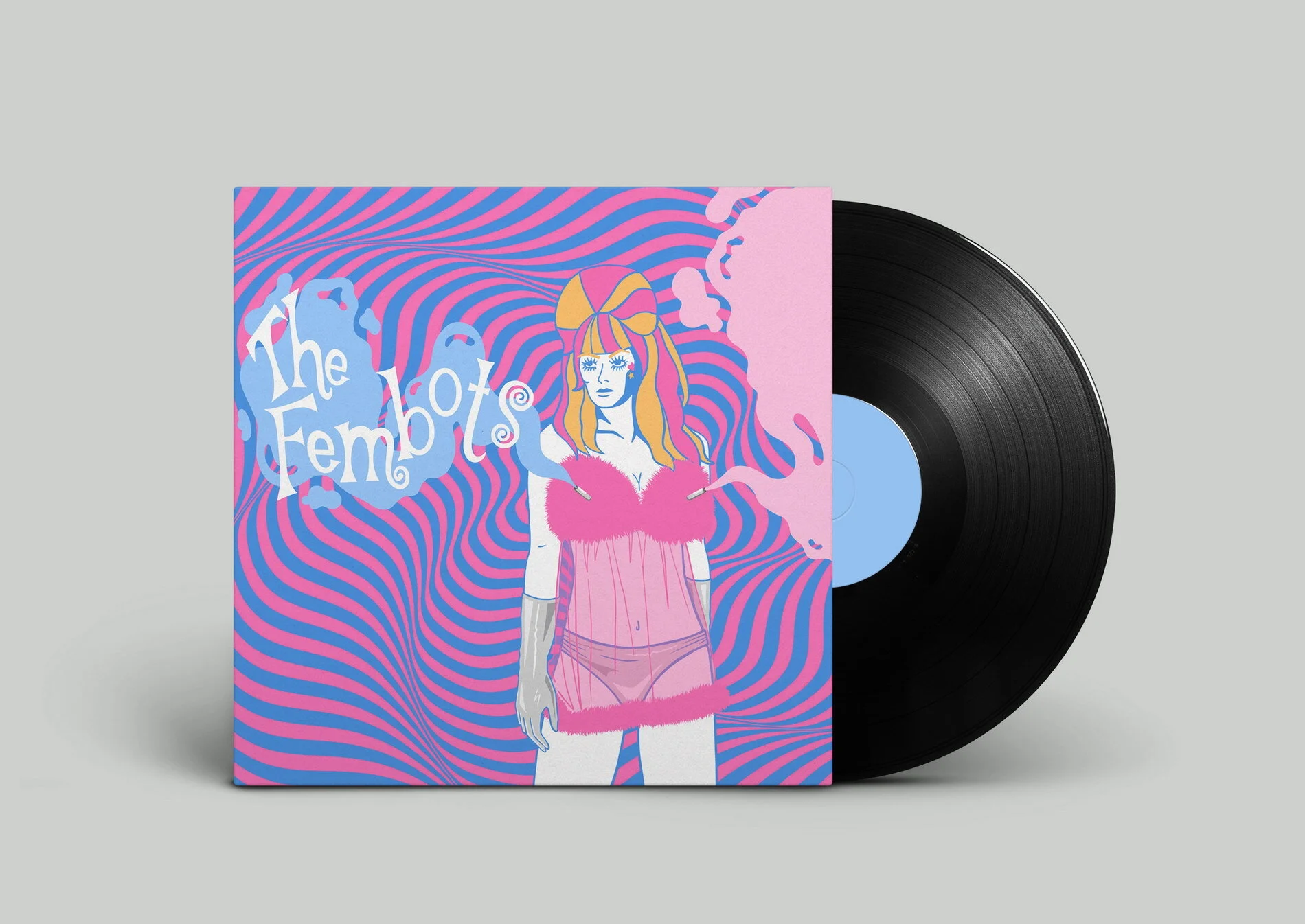
“The Fembots” by Tobin Elias Eckstein
I’m not especially knowledgeable on the 60’s...my parents were teens in the grunge era. I had Beastie Boys and Tool, not The Beatles or The Doors. So, all of the 1960’s education I received was from the grooviest man himself: Austin Powers. My vinyl cover imagines ‘The Fembots’ from the films as a chart-topping girl group, spreading radical love through song and their aphrodisiac spraying nipple barrels.
Instagram: @tobineliasart